Bob Dylan’s Best and Worst Album Covers

My relationship with Bob Dylan is similar to my relationship with Woody Allen: I’m a fan of these old Jewish guys, and I get excited when a new release is announced. Even after “Knocked Out Loaded,” even after the film “Celebrity,” I keep the faith — and when I’m treated to a “Time Out of Mind” or a “Midnight in Paris,” it’s as if my steadfastness has been rewarded.
In this context, album covers and film posters (or their digital equivalents) become deeply important. What do they reveal? What do they say about this next project from the old master? And will it be any good?
It was thus with dismay that I first gazed upon the cover of Dylan’s new release, “Tempest,” which came out on September 11. It is, in my opinion, the worst Dylan cover ever — and there have been some doozies over the years. Fortunately, the songs on “Tempest” are actually quite good late-model Dylan, complete with retro stylings, apocalyptic pronouncements, bar-band messiness and biblical allusions. But the tossed-off nature of the cover has led me to muse on Dylan covers past and present, and to compile this highly idiosyncratic list, counting down the five best and five worst album covers from the bard’s 50-year career.
The Best
5. Slow Train Coming (1979)

Jewish fans of Dylan may despise this album, the first of Dylan’s short stint as a born again Christian. But the cover, with its subtle cross symbolism, vision of redemption and home-grown feel, perfectly captures Dylan’s spiritual renaissance after a few years of drug and alcohol addiction — itself well captured on the cover of his previous album, “Bob Dylan at Budokan.” Like “John Wesley Harding,” which it narrowly beat out for the No. 5 spot, the cover of “Slow Train” is at once enigmatic and revealing. You want to know more.
4. World Gone Wrong (1993)

This cover is the first time we really saw the Dylan who now has been with us for 20 years: a grizzled old singer of traditional songs that pack emotional wallops behind deceptively simple facades (the songs here are all traditional folksongs, performed by Dylan and accompanied only by his own guitar and harmonica). Seated in front of one of his own paintings, Dylan isn’t hiding his age here — quite the contrary. He wrote in the first volume of his quasi-memoir, “Chronicles,” that he realized that in order to do these songs justice, he’d have to become a new man entirely. That man is pictured on the cover.
3. Greatest Hits (1967)

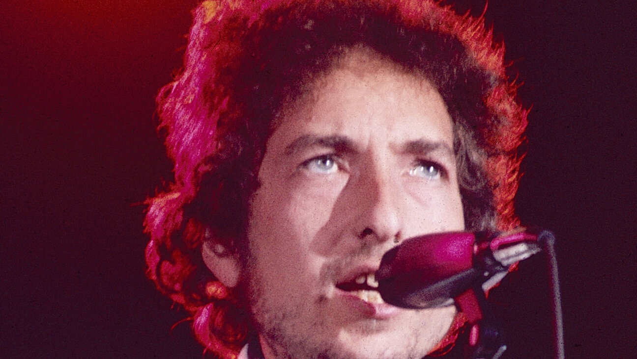
Few remember today that Dylan’s first several albums, now classics, were not commercial successes. It was only after the electric period that his early work became known — and that, in large part, was because of this collection. The cover shot is iconic, situating Dylan right in the center of the 1960s, his profile backlit and his hair as if on fire. This Dylan would flicker out of existence only a few months later, to be replaced by the country crooner of his next few releases. But for a moment, electric Dylan was it.
2. Bringing It All Back Home (1965)

This is probably the most enigmatic Dylan cover of all. The image on the sleeve of “BIABH” signaled a rejection of Dylan’s protest-singer past and a new phase of creativity and complexity. Who is the woman in the background? What is the significance of the magazines on the table? Dylanologists have puzzled over these questions for decades. But this album, in its music and its cover art, was the first indication that Dylan would not conform to expectations and would instead surprise and mystify.
1. The Freewheelin’ Bob Dylan (1963)
Some images are just icons, and this cover is one of them. Capturing the youth and potential of the early 1960s, Dylan and his girlfriend, Suze Rotolo, huddle against each other as they walk down a New York street. They are cold, they are poor, they are young and they are happy. No wonder this image has been copied and parroted so many times (see, for instance, Cameron Crowe’s Tom Cruise flick “Vanilla Sky”): Is there a more iconic image of bohemian youth than this one?
Honorable mentions: “John Wesley Harding,” “Oh Mercy,”“Dylan & the Dead,” “Blood on the Tracks,” “The Basement Tapes.”
The Worst
5. Dylan (1973)

Really, this cover shouldn’t count, since the album was cobbled together without Dylan’s authorization, and until the digital era was quite hard to find at all. (It’s still unstreamable on bobdylan.com.) It’s a terrible collection of leftovers and covers, and its tossed-off, dated and clichéd album cover signifies that. Pure dreck.
4. Empire Burlesque (1985)

There were several bad Dylan albums in the 1980s, and all had bad covers: “Shot of Love,” “Knocked Out Loaded,” but worst of all, I think, is the slickly produced, badly written and generally woeful “Empire Burlesque.” The cover conveys everything that’s wrong about this album: the desperate attempt to remain current and fashionable (computer font! Miami Vice jacket!), the obscuring of what’s good about Dylan by superficial crap, and a factory-made look and feel that convinced all but the most faithful that Dylan had become a has-been.
3. Saved (1980)

Eerily prefiguring “Tempest,” the cover of “Saved” has a similar serif font and thoughtless aesthetic. The album is a poor retread: Where “Slow Train Coming” was spiritual and sincere, “Saved” was a pedantic sermon. The cover reflects that. “Saved” has Dylan performing in a kind of aura sent from heaven, in some amorphously cubist goo that reflects the messy production of the hastily thrown-together album. If you want to hate the Christian Dylan, hate “Saved.”
2. Planet Waves (1974)

I’ll probably catch some flak for this one, since the cover is Dylan’s own work, but I’m sorry, this drawing sucks. Dylan’s unreleased work with The Band, “The Basement Tapes,” came with a great cover that captured the whimsy and authenticity of the ensemble. But his only properly recorded album with them has a misdrawn peace symbol, a bad rendition of the Band’s members and a tossed-off feel; it belongs on a cocktail napkin. Worse, like the cover of “Tempest,” it undermines what’s good inside: an underrated release in an underperforming cover.
1. Tempest (2012)

And that brings us to Dylan’s new release, complete with 1983-era lipstick title font (see Klymaxx) and bargain-basement art direction. Did someone really get paid for this? There are better production values on Rebecca Black’s “Friday.” I think Dylan (or his team) is trying to evoke a mixture of the sacred and the profane here, since “Tempest” started out as an album of religious songs. But what he got looks cheap, like a first-year design student’s first foray into Photoshop. A disaster.
Dishonorable mentions: “Love & Theft,” “Christmas in the Heart,” “Shot of Love,” “Knocked Out Loaded,” “Another Side of Bob Dylan.”
Jay Michaelson, a contributing editor for the Forward, designed both album covers for his old garage band, The Swains.
A message from our Publisher & CEO Rachel Fishman Feddersen

I hope you appreciated this article. Before you go, I’d like to ask you to please support the Forward’s award-winning, nonprofit journalism so that we can be prepared for whatever news 2025 brings.
At a time when other newsrooms are closing or cutting back, the Forward has removed its paywall and invested additional resources to report on the ground from Israel and around the U.S. on the impact of the war, rising antisemitism and polarized discourse.
Readers like you make it all possible. Support our work by becoming a Forward Member and connect with our journalism and your community.
— Rachel Fishman Feddersen, Publisher and CEO


